Connect Your Content to Outcomes
Use your content, rather than ads, to reach and expand audiences, drive 3x more engagement, and 2x more efficient outcomes—all without cookies.

Use your content, rather than ads, to reach and expand audiences, drive 3x more engagement, and 2x more efficient outcomes—all without cookies.
Scale content to inform, influence, and educate your audience as they are forming opinions and making purchase decisions with Nativo’s privacy-compliant technology: SPARC.

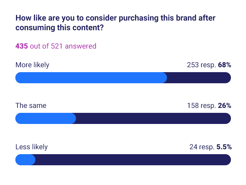
Boost performance and drive action with engaging content formats and actionable insights. The result: 2x the performance of third party cookies without the data fees.

.png)
For most advertisers, there’s a gap between awareness and action and that’s because this is the part of the journey where your prospects are consuming content, not ads.
Nativo allows you to engage these audiences at scale with existing brand content experiences in editorial environments where and when they are actively engaging with content.
Bridge this gap in your strategy and accelerate the customer journey with Nativo.


Whether it’s articles, videos, influencer content, stories, images or PR— brands produce a tremendous amount of content. The challenge is making sure that content reaches the right people and has impact. Nativo makes it easy to activate, scale, and measure your content.
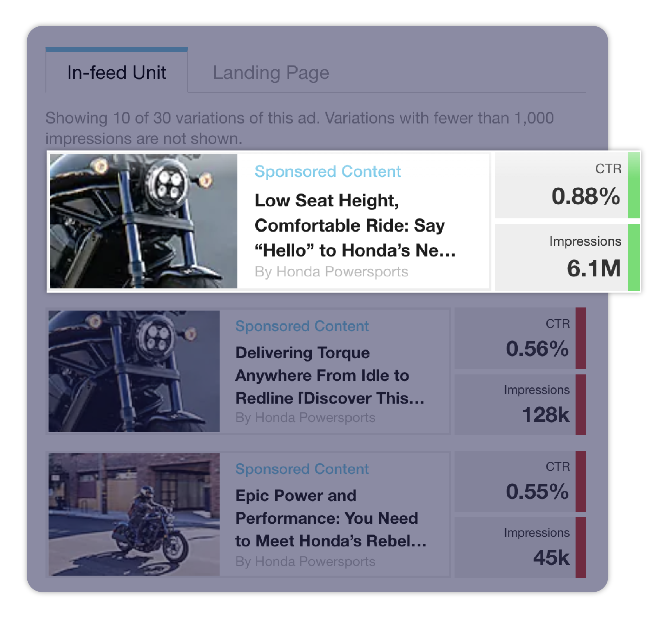
Nativo can increase the performance of your creative by 5x by automatically A/B testing a combination of headlines, images, and content. Test different types of content. Should you lead with images? A video? Test it. Nativo will make your content work harder for you.
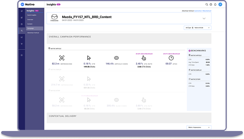
What type of people are engaging with your content? What else are they interested in? What will work in the future? Nativo takes the guess work out with its advanced insight platform. Get the richest engagement insights available in the market.
Nativo also has integrated lift measurement to see your campaigns impact on purchase intent and brand perception. You can also connect this impact on consideration to action by targeting audiences that are most likely to engage with your content with lower funnel messaging and ads that link directly to your site so they can take action.
“We're thrilled with the instant impact the Nativo campaign has had on job applications and hires, especially considering that this was primarily an awareness campaign, with the secondary goal of driving applications on our site. You all have been an absolute pleasure to work with!”
Senior Director, Employer Brand & Social Media
Spectrum
Read the Case Study
“We can introduce people to Utah through images that really resonate and capture your imagination through a mix of storytelling and content marketing like we do with Nativo. In fact, I’d say partnerships like we have with Nativo have been some of the most powerful drivers of traffic to our website.”
Director of Creative and Content
Utah Office of Tourism
Nativo unveils Nativo Predictive Audiences: transforming audience targeting in the cookieless era.
With Nativo, Hearst improved campaign delivery, efficiency, and ultimately, sales - resulting in a 6x return on investment.
.png)
Nativo Unveils Nativo Predictive Audiences: Transforming Audience Targeting in the Cookieless Era
Read More
Nativo Predictive Audiences Has Arrived, Lifting Advertisers Toward a Cookieless Future
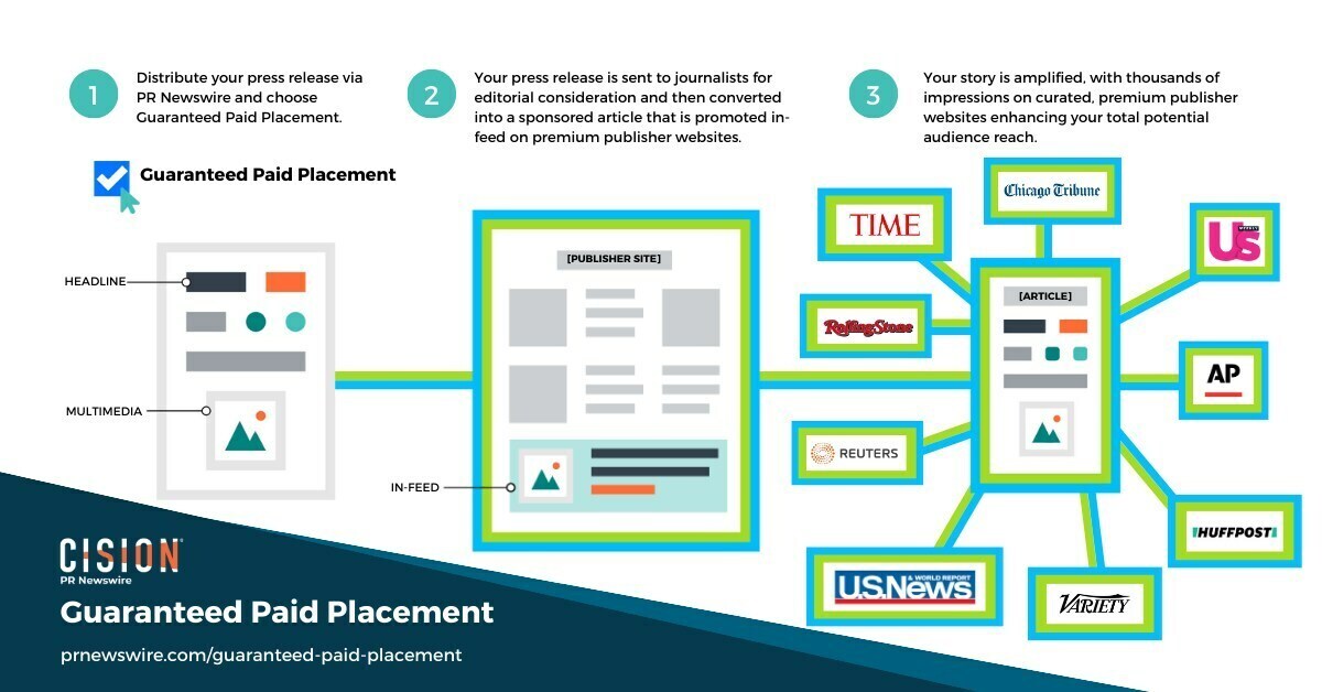
Content from thousands of PR Newswire clients has garnered 400 million impressions through Guaranteed Paid Placement.
Read More
Cision Unveils Guaranteed Paid Placement, Providing Clients with Unmatched Visibility and Control over their Brand's Story
.png)
Nativo announced recognition from workplace culture company Comparably for its Best Department award: Best Sales Team.
Read More
Nativo Awarded Third Comparably Award for Best Sales Team


